Yeah I understand, plus it's fitting for the story of Kingdom Come that this Superman's symbol is, shall we say, distorted. It's just that when I first saw that symbol, without having read Kingdom Come, I was all like, "That is such a terrible Superman symbol" and that feeling's stuck with me since, like a pet peeve.I don't necessarily mind it, but I get where you're coming from. Kingdom Come is one of my all-time favourite comics, so I might be a bit biased. I think Alex Ross' intention was to make the symbol as simplistic as possible. So the top curve of the symbol is blended into the triangle itself. It's meant to be a darker design, to reflect his feelings on the world he's in in that story.
I wouldn't want it as a permanent design, but I think it's suitable for the story in Kingdom Come.
Posting image behind spoilers for reference for others:

[Movies] The DC Cinematic Universe - The David Zazlav Dumpster Fire.
More options
Export threadOh yeah, I recall even fan reaction was like that at the time, too. I wasn't crazy about it at first.Yeah I understand, plus it's fitting for the story of Kingdom Come that this Superman's symbol is, shall we say, distorted. It's just that when I first saw that symbol, without having read Kingdom Come, I was all like, "That is such a terrible Superman symbol" and that feeling's stuck with me since, like a pet peeve.
My beef is when it keeps showing up elsewhere when it's not really Kingdom Come Superman. Like Brandon Routh's appearance in the Crisis crossover. They used...bits of the Kingdom Come story but it wasn't quite the same.
At least it looks more like an S than whatever the hell they had going with the Batman Beyond Superman symbol.
GREAT episode, but I hate the design.
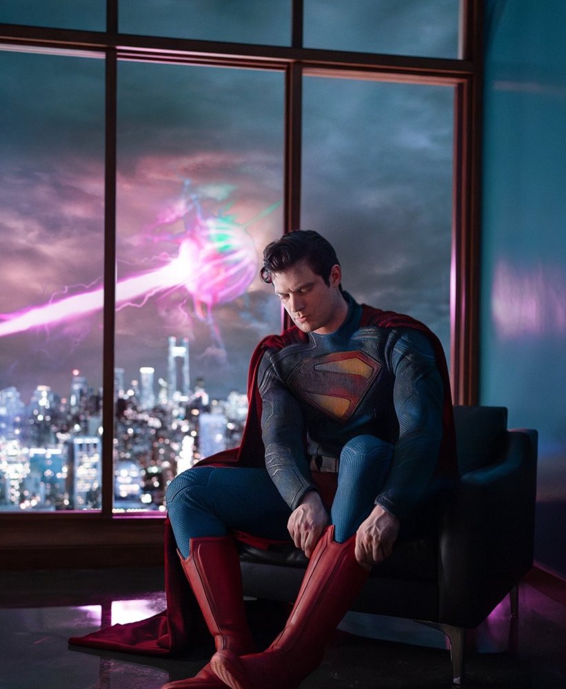
We have our first good look at David Corenswet for James Gunn's upcoming Superman movie.
Good: Red trunks!
Bad: Kind of dulled colors. I wanted something a bit brighter.
Good: It's form-fitting, but not skin tight.
Bad: The collar is...ehhhhh, it's fine. I'll get over it.
Good: PRETTY sure that's Solaris in the background.
Good: I like the laid back working man kind of pose they're evoking here.
Good: S-shaped spit curl!
So yeah, overall, more wins than losses. I don't know why I'm not feeling more excited for a James Gunn directed Superman movie. I love his Guardians movies, and I like a lot of his other work. But I keep hearing there are multiple other relatively big name actors in this playing other superheroes, like Nathan Fillon playing Guy Gardner. And I just...I really just want a good, standalone Superman movie first without tying into a bigger universe. Maybe that's too much to ask in the age of shared universes.
Only one change I would've made. Have him looking back over his right shoulder, out the window at what's going on out there. Everything else is the same, but it would convey more urgency and shows his desire to keep his eye (literally!) on Metropolis.I find it odd that Superman would still be nonchalantly putting on his boots when there's a crisis actively going on right outside the window.
Also would've put that spit curl in profile, so... bonus.
--Patrick
Last edited:
