
Export thread
Cover art done, next step
#1

Hailey Knight
Hailey Knight
I'm getting ready to release a 99 cent ebook novella and while most of the work for that is done, one last but crucial detail is the cover art. Julie is going to paint it, because she is wonderful and talented (AND generous). She's already painted a gorgeous cover for another project that I don't know when will ever get finished because I'm not as wonderful and talented as she is.
But for this project, we're having a hard time figuring out an attention-grabbing cover. I haven't shown these crummy Photoshop mockups to her yet, though I have a favorite already, but I thought I'd run them by you guys. None of these will be the final cover, but it'll essentially be the source image for her eventual painting that'll be the cover. All the placeholder images within were from Google.
1, 2
3, 4
5, 6
#2

Dave
Dave
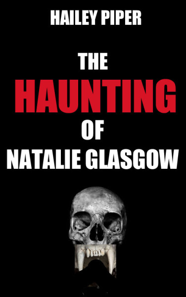
Anything other than 2 or 5 has too much unused space and makes the cover look sparse. In my opinion, of course.
#3

Bubble181
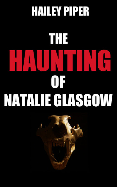
Between 3 and 4, I think it depends on what kind of skull is implied/used/suggested in the story. Is it about a werewolf, or an attack dog, or whatever?
Bubble181
To counter, I think 5's too busy and full, and I prefer a more clean, tight look for a cover. I do like 2 too, though.Anything other than 2 or 5 has too much unused space and makes the cover look sparse. In my opinion, of course.
Between 3 and 4, I think it depends on what kind of skull is implied/used/suggested in the story. Is it about a werewolf, or an attack dog, or whatever?
#4
Hailey Knight
I'm glad I did a poll. My favorite was 3, but no one's voting for it. Dave seems to have the right of it for 2 or 5. For an ebook cover, where all you have is that tiny space on Amazon, that little bit counts.
Hailey Knight
I've learned over time that the cover content and the story relationship can be near zero. What matters is to get the mood across. That's nonsense to me as a story teller, but that's advertising.To counter, I think 5's too busy and full, and I prefer a more clean, tight look for a cover. I do like 2 too, though.
Between 3 and 4, I think it depends on what kind of skull is implied/used/suggested in the story. Is it about a werewolf, or an attack dog, or whatever?
I'm glad I did a poll. My favorite was 3, but no one's voting for it
. Dave seems to have the right of it for 2 or 5. For an ebook cover, where all you have is that tiny space on Amazon, that little bit counts.
#5

Terrik
Terrik
5 is the only one that caught my interest.
#6

PatrThom
PatrThom
I voted 2 and 5 for much the same reasons that Dave did. I wanted to also include #1, but the poll only allows for a max of 2 selections. 2 and 5 look like the best ones for a single-cover picture BUT #1 lends itself to wrapping from the front cover around the jacket to the back cover. Not as important if it's just going to be an e-book, but something to consider if you decide to do a print copy.
--Patrick
--Patrick
#7
Hailey Knight
Hailey Knight
No print book unless some time in the future I plan to collect multiple novellas together, and if I do it'll be a different cover, so no worries for this particular one.I voted 2 and 5 for much the same reasons that Dave did. I wanted to also include #1, but the poll only allows for a max of 2 selections. 2 and 5 look like the best ones for a single-cover picture BUT #1 lends itself to wrapping from the front cover around the jacket to the back cover. Not as important if it's just going to be an e-book, but something to consider if you decide to do a print copy.
--Patrick
#8

Tinwhistler
Tinwhistler
I didn't look at the pics very closely.
I quickly scanned them and then chose the one that would most likely make me want to click it if it were on amazon (which is pretty much how I, and I think most people, impulse buy on Amazon).
So, #5
I quickly scanned them and then chose the one that would most likely make me want to click it if it were on amazon (which is pretty much how I, and I think most people, impulse buy on Amazon).
So, #5
#9
Dave
Dave
That is an excellent way of doing things. I still like 2 better as it leaves more to the imagination than 5, but that's just me.
#10
Tinwhistler
But, when I (finally? ever?) finish book 3, I'm having all of the covers redone.
Tinwhistler
My own book covers fail that test, incidentally. But I like them too much and I'm not yet willing to shell out $600 to have it redone to my liking that still fits within marketing goals.That is an excellent way of doing things. I still like 2 better as it leaves more to the imagination than 5, but that's just me.
But, when I (finally? ever?) finish book 3, I'm having all of the covers redone.
#11
Hailey Knight
Hailey Knight
Sadly the days of the elaborate detailed cover are gone since on Amazon it will just look like a small rectangle of messy colors.
I'm pretty sure I'll only be showing #2 and #5 to Julie at this point, but my feeling is we'll go with #5 for her to paint.
Thanks for the input, everyone! I'm hoping to get it up on Amazon by the start of October.
I'm pretty sure I'll only be showing #2 and #5 to Julie at this point, but my feeling is we'll go with #5 for her to paint.
Thanks for the input, everyone!
I'm hoping to get it up on Amazon by the start of October.
#12
Bubble181
Bubble181
Just make sure it physicially fits with the other two, yours and Nick's are all the same size and I don't want one book that's just a quarter of an inch taller or shorterMy own book covers fail that test, incidentally. But I like them too much and I'm not yet willing to shell out $600 to have it redone to my liking that still fits within marketing goals.
But, when I (finally? ever?) finish book 3, I'm having all of the covers redone.
#13
PatrThom
--Patrick
PatrThom
You know, you could potentially use this to your advantage by leveraging hybrid images. Might even fit the feel of the story.Sadly the days of the elaborate detailed cover are gone since on Amazon it will just look like a small rectangle of messy colors.
--Patrick
#14
Dave
Dave
That's an interesting idea. See what happens when you merge 2 & 5?
#15

Grytpipe-Thynne
Grytpipe-Thynne
Number Four.
#16
Tinwhistler
")
Tinwhistler
9X6 is a standard size, and I don't intend to change itJust make sure it physicially fits with the other two, yours and Nick's are all the same size and I don't want one book that's just a quarter of an inch taller or shorter
#17
Hailey Knight
Hailey Knight
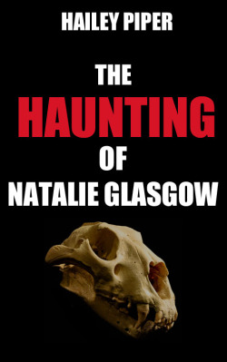
Welp, things went in a different direction than expected. Julie didn't really care for any of them and felt that bones/teeth were outside her wheelhouse, so either I come up with a cover that works in her comfort zone or try to do this myself. I'm kind of stumped on what else to come up with (she'd feel better if it was something abstract, a landscape, a house, so maybe a moody house like The Haunting of Hill House), but for the moment this is my WIP based off #2.
My vector skills aren't too advanced, but it being just teeth and text, I think I can manage. Any feedback is super appreciated!
My vector skills aren't too advanced, but it being just teeth and text, I think I can manage. Any feedback is super appreciated!
#18
PatrThom
PatrThom
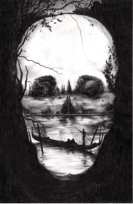
If she wants something like a landscape, but you want a skull, then see if you can find someone to put together one of those "It's a landscape but not really" kind of compositions, like this:
--Patrick
--Patrick
#19

drifter
drifter
I like how this turned out. The tighter crop and slight abstraction of the teeth turned out great imo. My only suggestion would be to work on the word spacing/placement and try for a font that’s a little less generic-looking.
My vector skills aren't too advanced, but it being just teeth and text, I think I can manage. Any feedback is super appreciated!
#20
Hailey Knight
Hailey Knight
Word spacing as in tighter together or farther apart?I like how this turned out. The tighter crop and slight abstraction of the teeth turned out great imo. My only suggestion would be to work on the word spacing/placement and try for a font that’s a little less generic-looking.
That's brilliant! I'll have to run it by her and see if she wants to.If she wants something like a landscape, but you want a skull, then see if you can find someone to put together one of those "It's a landscape but not really" kind of compositions, like this:
View attachment 27585
--Patrick
#21
Hailey Knight
Hailey Knight
Of and Natalie could be on the same line on the right side of the House with the last name beneath at the same length, actually.
#22
drifter
drifter
Probably a bit of both. Also maybe experiment with overlapping the text on the image a bit if you haven’t already. You can use outlines or drop shadows if legibility suffers.Word spacing as in tighter together or farther apart?I like how this turned out. The tighter crop and slight abstraction of the teeth turned out great imo. My only suggestion would be to work on the word spacing/placement and try for a font that’s a little less generic-looking.
#23
Hailey Knight
PatrThom's idea may have to wait for a future cover for something as Julie and I are struggling on any other concept, so what I'm doing off #2 will most likely be the cover.
Hailey Knight
I'll play around with it, especially since I need to make my base image larger, but I want to be careful not to obscure the minimal imagery so much that what is is becomes unclear.Probably a bit of both. Also maybe experiment with overlapping the text on the image a bit if you haven’t already. You can use outlines or drop shadows if legibility suffers.
PatrThom's idea may have to wait for a future cover for something as Julie and I are struggling on any other concept, so what I'm doing off #2 will most likely be the cover.
#24
Hailey Knight
Hailey Knight
Or do something Julie likes, such as the first edition for The Haunting of Hill House.
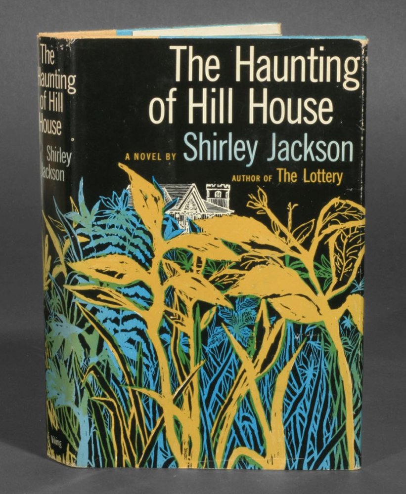
Flowers!
Flowers!
#25
PatrThom
PatrThom
Eeeevil flowers.
—Patrick
—Patrick
#26
Hailey Knight
.
Hailey Knight
In a move that is completely not surprising to me or her, this is what she wants to doEeeevil flowers.
—Patrick
.
#27

ThatNickGuy
ThatNickGuy
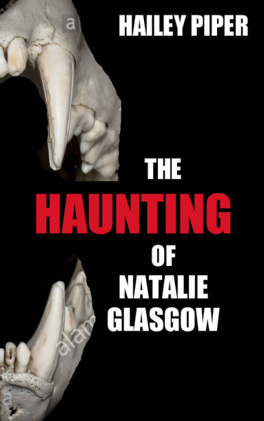
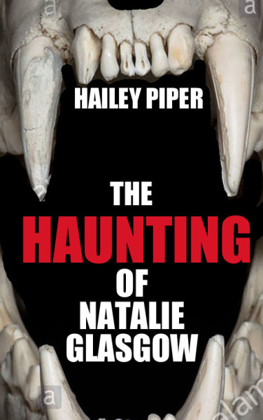
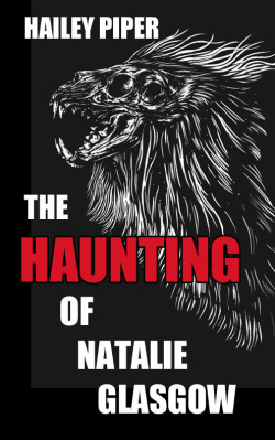
I dig the hell out of #2. I like the way the jaws wrap around the title. It's the most eye-catching to me.
#28
Hailey Knight
It's going to be one of these. I'll figure out which soon based on either input or not feeling my eyes burning out from staring at Photoshop the past five hours (weeeee!)
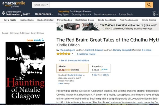
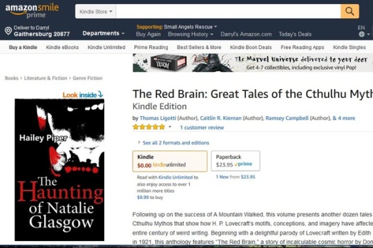

F:
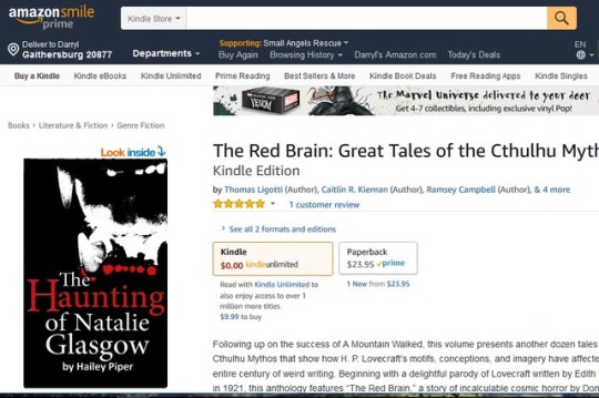
I will really need to buy a copy of The Red Brain after using it for all these mock-ups.
Hailey Knight
Well, we're going with the jaws, but the image is less the placeholder and more the permanent now.I dig the hell out of #2. I like the way the jaws wrap around the title. It's the most eye-catching to me.
It's going to be one of these. I'll figure out which soon based on either input or not feeling my eyes burning out from staring at Photoshop the past five hours (weeeee!)
F:
I will really need to buy a copy of The Red Brain after using it for all these mock-ups
.
#29
PatrThom
PatrThom
The placement of the text is better in the first two (they don't intrude over the canine on the lower left), but I almost wish the "The" could be moved up and left somehow, so the red-tipped canine in the second one would fit better into the pocket formed by the H and A in "Haunting," but I can't think of a good way to do that without either making "The" vertical or enlarging/widening the H enough to tuck the "The" between its uprights (though maybe that would be a little too much Sue Grafton?).
--Patrick
--Patrick
#30
Hailey Knight
In the morning, when I haven't been staring at it for so long.
Hailey Knight
I can move The over the H; most of the words each have their own layer. I don't think I'd sit The between the prongs of H when the image is going to be so tiny. That said, some people like everything nestled and clean, others like it when the letters cross over/interact with the image, so no one design will please everyone. But no harm in moving it around and seeing how I feel about it.The placement of the text is better in the first two (they don't intrude over the canine on the lower left), but I almost wish the "The" could be moved up and left somehow, so the red-tipped canine in the second one would fit better into the pocket formed by the H and A in "Haunting," but I can't think of a good way to do that without either making "The" vertical or enlarging/widening the H enough to tuck the "The" between its uprights (though maybe that would be a little too much Sue Grafton?).
--Patrick
In the morning, when I haven't been staring at it for so long.
#31
Hailey Knight
Hailey Knight
I think next time I'll browse this place for my own sanity:
https://thebookcoverdesigner.com/
They have pre-designed covers that will insert your title and name, and from then on you own that design and it won't be sold again. The prices vary, as you'd expect, but even some of the lower end ones are pretty nice.
https://thebookcoverdesigner.com/
They have pre-designed covers that will insert your title and name, and from then on you own that design and it won't be sold again. The prices vary, as you'd expect, but even some of the lower end ones are pretty nice.
#32
drifter
drifter
I like number 3 the best. I think the red added to the teeth looks kinda cheesy. I'm also not a fan of having your name in between the upper and lower jaw, feels awkward to me.Well, we're going with the jaws, but the image is less the placeholder and more the permanent now.
It's going to be one of these. I'll figure out which soon based on either input or not feeling my eyes burning out from staring at Photoshop the past five hours (weeeee!)
F:
I will really need to buy a copy of The Red Brain after using it for all these mock-ups
#33
Hailey Knight
Last round of editing will be this weekend, and then I'll release the novella before October.
Hailey Knight
That's where Julie and I have come to. I wanted to break up some of the white with more red, but I haven't been able to get it ... probably because it looks cheesy.I like number 3 the best. I think the red added to the teeth looks kinda cheesy. I'm also not a fan of having your name in between the upper and lower jaw, feels awkward to me.
Last round of editing will be this weekend, and then I'll release the novella before October.
#34
Hailey Knight
Hailey Knight
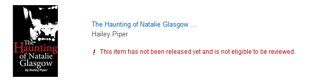
Welp, it's up in its way. The actual release day will be October 2nd.
I can't help feeling I'm being too hyperbolic in the book blurb, but from what I'm told, if I don't feel like I'm going too far, then I'm not going far enough.
But the cover looks good, and I want to thank everyone for their input. I know it looks a bit different from #2 in the original poll, but the source of it was there. I appreciate all the help")
I can't help feeling I'm being too hyperbolic in the book blurb, but from what I'm told, if I don't feel like I'm going too far, then I'm not going far enough.
But the cover looks good, and I want to thank everyone for their input. I know it looks a bit different from #2 in the original poll, but the source of it was there. I appreciate all the help
#35
Hailey Knight
Hailey Knight
If I sent anyone the novella, would you be willing to write a review on Amazon when it releases? It's about 50 pages. Two or three sentences would be a big deal (honest sentences, even if you didn't care for it).
At this point I know I'm asking a lot, but if anyone's up for it, please let me know here or PMs and I'll send the file (Word or ebook or whatever format).
At this point I know I'm asking a lot, but if anyone's up for it, please let me know here or PMs and I'll send the file (Word or ebook or whatever format).
#36
Tinwhistler
Tinwhistler
You can send me the novella early, if you'd like, and I'll mention it as "The author sent me an ARC to review..."
Amazon will strike reviews if they think they're quid pro quo, or if they're written by friends and family.
Amazon will strike reviews if they think they're quid pro quo, or if they're written by friends and family.
#37
Hailey Knight
I'll send it when I get home this evening. Thank you, Tin!
Hailey Knight
Did not know that! I guess things have advanced a bit. Which is probably for the best.You can send me the novella early, if you'd like, and I'll mention it as "The author sent me an ARC to review..."
Amazon will strike reviews if they think they're quid pro quo, or if they're written by friends and family.
I'll send it when I get home this evening. Thank you, Tin!
#38
Tinwhistler
Tinwhistler
Finished it up. I've spent more money on books that I enjoyed far less. Here's the review that I'm going to put on Amazon.
This review based on an Advanced Review Copy sent by the author.
Let me state right up front, I really enjoyed this tale. I love horror and supernatural drama when it's well written. I hate it when it's full of cliche and melodrama.
This is a brisk and tightly written story, which got under my skin right away and kept me hooked until the very end. Hailey Piper has an excellent grasp of language and metaphor, and the writing and grammar are impeccable. There was nothing to get in the way and distract me from the story itself--which was suspenseful and well-paced. While resting comfortably within the horror genre in terms of theme and subject matter, I didn't feel like any part of the story was stale or formulaic. It felt fresh and new, and like any good horror author, she kept the nature of the danger shrouded in mystery right up until the end.
I would love to see more of Hailey Piper's work, and I would definitely pick up an anthology of such stories, if she ever put one together.
#39
Tinwhistler
Tinwhistler
Which, I guess will have to wait until Oct 2. to go up on the site.
FWIW, I felt the story was totally worth the price, and even though I got the ARC for free, I went ahead and pre-ordered the book. So, when my review is written, it'll say "verified amazon purchase" on it, and I'll strike the line about reviewing from an ARC (since I paid for it, after all)
FWIW, I felt the story was totally worth the price, and even though I got the ARC for free, I went ahead and pre-ordered the book. So, when my review is written, it'll say "verified amazon purchase" on it, and I'll strike the line about reviewing from an ARC (since I paid for it, after all)
#40
Hailey Knight
Re: an anthology, I have enough stories to put an anthology together, but right now only one short has been accepted by a magazine and I'm hoping more of them will get that chance before I put them out as a collection.
Though Tin very kindly paid for his in the end, if anyone else would like to read it to review, I'm happy to send an advance review copy.
Hailey Knight
Wow, thank you, Tin! Not just for reading and reviewing, but I really appreciate your kind words on the ability. It means a lot.Which, I guess will have to wait until Oct 2. to go up on the site.
View attachment 27626
FWIW, I felt the story was totally worth the price, and even though I got the ARC for free, I went ahead and pre-ordered the book. So, when my review is written, it'll say "verified amazon purchase" on it, and I'll strike the line about reviewing from an ARC (since I paid for it, after all)
Re: an anthology, I have enough stories to put an anthology together, but right now only one short has been accepted by a magazine and I'm hoping more of them will get that chance before I put them out as a collection.
Though Tin very kindly paid for his in the end, if anyone else would like to read it to review, I'm happy to send an advance review copy.
#41
Hailey Knight
Hailey Knight
The last day before I can edit anything and I'm still conflicted about price. I originally wanted to charge 99 cents for the book because it's a 50-page novella, but now that a magazine is, divvying things up, essentially charging people $2 for a 6-page story I wrote, I feel like I should put it up to at least $2.99. Also, that way I can come down in price later, whereas if I start at 99 cents then I'm already as low as I can go without giving it away.
I think my next novella I'll try to shop around to smaller presses so I don't have to think about this stuff. But I couldn't find one that would look at a 15k word story. It's too long for short stories, too short for what they want in novellas (usually 17k and I couldn't justify padding it by 2k words; I didn't want to ruin the pacing).
I think my next novella I'll try to shop around to smaller presses so I don't have to think about this stuff
. But I couldn't find one that would look at a 15k word story. It's too long for short stories, too short for what they want in novellas (usually 17k and I couldn't justify padding it by 2k words; I didn't want to ruin the pacing).
#42
Hailey Knight
Hailey Knight
Release day!
I'm really excited! I wish I could focus on it more than all this housing nonsense, but I'm making time where I can to promote here and there online.
@Tinwhistler Whenever you get a chance, I hope you'll post your review. Sorry it was such a stretch between.
I'm really excited! I wish I could focus on it more than all this housing nonsense, but I'm making time where I can to promote here and there online.
@Tinwhistler Whenever you get a chance, I hope you'll post your review. Sorry it was such a stretch between.
#43
Tinwhistler
I got the notification of the charge last night, but it wouldn't let me actually post a review then.
Tinwhistler
DoneRelease day!
I'm really excited! I wish I could focus on it more than all this housing nonsense, but I'm making time where I can to promote here and there online.
@Tinwhistler Whenever you get a chance, I hope you'll post your review. Sorry it was such a stretch between.
I got the notification of the charge last night, but it wouldn't let me actually post a review then.
#44
Hailey Knight
Hailey Knight
Thank you! I really appreciate it.Done