Welcome to Yielding

Status
Not open for further replies.
Okay guys, I know we have the comics forum for this stuff but I'm creating this thread to get opinions/tips/crits on my front page comic from the artistic community of the forums. This includes the writers! I'm the first to admit that my writing skills may lack and aren't suffecient enough to go with the ideas in my head.

I know its kinda messy at the moment but I'm still trying to figure out lay out and hot to do good word bubbles. I think the latsest page show a marked improvement in panel lay out!

Any ways, here are the first four pages.

Page001.jpg


Page002.jpg


Page003.jpg


page004.jpg


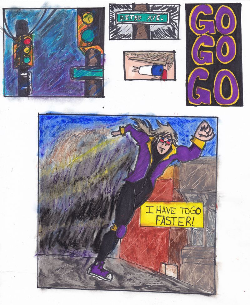
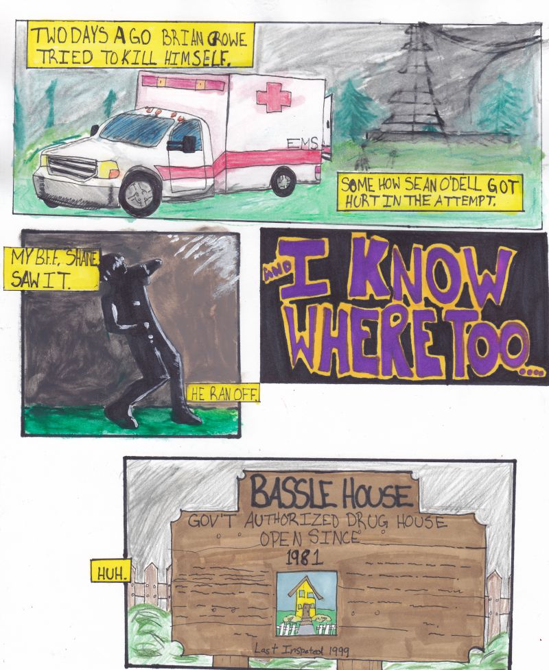
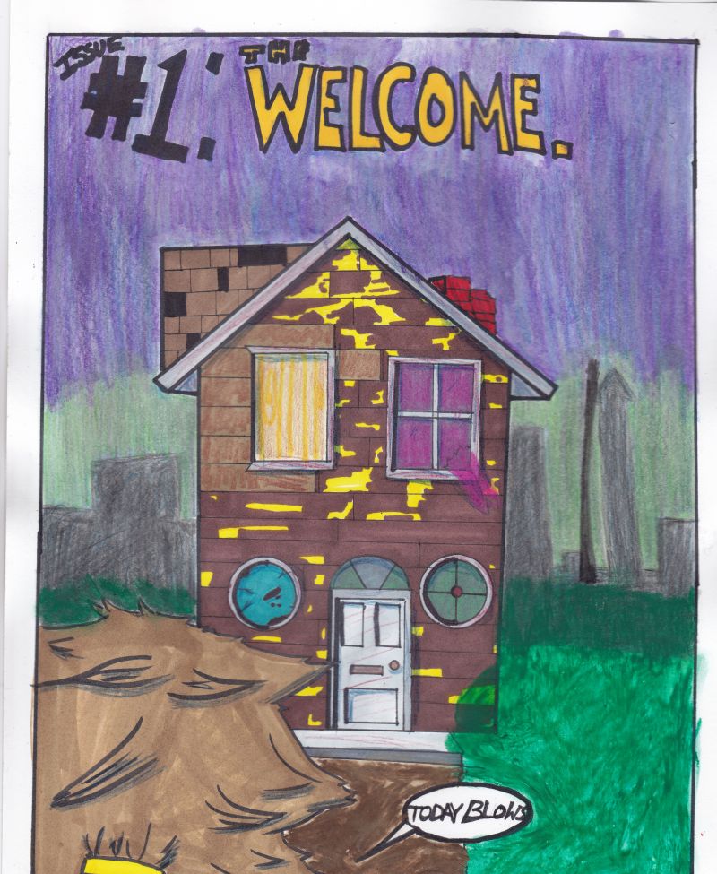
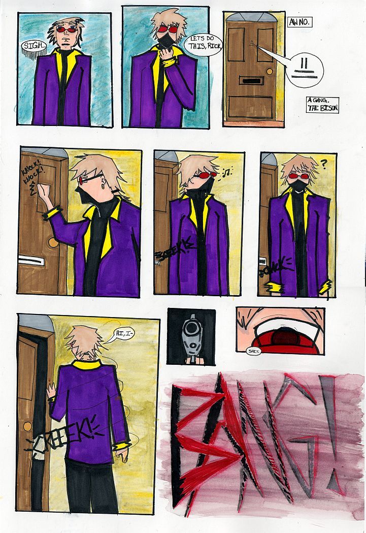
The first few pages were done on 8x10 sheets of paper while the last one was done on a 11x17. I think this makes a big difference in giving me a lot more room to work with.

So, have it!
 
The words could stand to be much bigger. Shrunk to the front page size, the last page is nearly impossible to read. It would also help if you gave them a consistent margin between the wording and the inner edge of the balloons/boxes.

Your art style works well for your backgrounds, I particularly love the street lights in the very first panel. But your human anatomy I find to be very stiff and flat. His foot in the first comic looks as if it's twisted in an unnatural way for the angle you drew him at. I think you would benefit greatly from practicing pose drawing either from a live model or from posemaniacs.com.
 
I noticed that about the words. :( They are very small for the front page! I may ask Dave if the pages can bigger as they show up nicely when they have been scanned.

I agree about my anatomy. I am working on it! I practice daily!
 
Agree in general with what David said. Also wouldn't hurt to pay more attention to your panel layout. The random panel shapes and gutter widths aren't a great look, IMO.

Regarding that last page: maybe it's just me, but if you're going to use different line weights, I'd suggest using something a little heavier for the protagonist's body, and possibly something slightly lighter for the clothes. The fact that you use the same pen weight on the head as on the background, while the clothes have this huge heavy weight, is something I find rather distracting.
 
Regarding panel lay out: If I were you I would use a ruler to draw out all the panels at once. So basically, plot the page with rough blue-lines and then draw the panels and then draw inside the panels. Make sense? That will help.
 
Drifter: Thanks for the tips on the line weight. I find I struggle when I ink, despite it being my favourite part. I find myself thinking "That isn't heavy enough" and I keep adding thinker blacker lined as if I have OCD or something. I'll try to remain more aware of myself next time.

Espy: Not a bad idea. I just worry about committing myself to one panel size before I'm done the initial drawing, you know? Like, what if I want to do something else? Regardless, this isn't a thread for me to rebuke good suggestions. I'll give it a try next time. :)
 
I look forward to seeing it 10 strips from now, and I mean that in a friendly way! Story and art look like they're both going somewhere but at one strip a week, I can't wait! :D

Also, Dave should definitely make the page image bigger on the front. There's no reason to keep it small, since you're the only strip now.

Again, looking forward to more. :)
 

fade

Staff member
Yeah, I was going to try to politely say I'm confused. I would say it's okay to confuse the reader on story, but I'm not clear who is who here, or who is talking in the exposition boxes. Is it the guy in purple, or is he one of the named characters? I'm guessing it's the guy in purple, but then it also kind of looks like it could be a flashback. Where does this sign come from? Was that the runner's destination? I can guess that, but there's this ambulance scene in there throwing me off. Was that a flashback?

On the art front, your sense of motion is really good. I like the running scene and the "bang" in particular. Probably wouldn't hurt to use a reference for some of this stuff, though, if you aren't already. E.g. the aforementioned anatomy.
 
The text boxes are Ricks. He's our good guy narrator for a little bit. :) He also talks...a lot, even if it is just to himself. Though that hasn't come across in the first few pages yet. I really didn't know how to make it clear yet. I didn't want him addressing the audience directly, I just wanted him to be constantly going over thing in his head.

Besides, in a few weeks we will meet a person who speaks directly to us as a story teller for the antagonist.

I'm probably saying to much.

I do use photo references for more complicated poses. Like the running or him knocking on the door. Other wise , I just get my husband to pose real quick and I do a quick line drawing. I guess I just really suck with anatomy. :p
 
Tossing up the new page. It should be on the front page shortly! :)

page005.jpg


I like this page!

Things I've changed:

-Measured out the panels to be more even. It does sort of fall apart in the last two panels though.
-Used a lighter line weight in the clothing compared to the flesh.
-Tried to make the word balloons more legible and keep the margins straight. Worked well when done in pencil but once inked it went to hell. I think I know how to correct this for the next page.
-Took a picture of my husband doing the pose in panel 4 so I had a longer time to look at it and work from it.

Things I fucked Up:
-Forgot to draw Rick standing on the porch in Panel 6. Was totally annoyed when I realized I did that.
 
page006.jpg


So, I discovered while doing this page, with the 'help of my damaged clavicle, that I lean really heavily on my desk when I draw. The pain was so great that I was sweating bullets. I think you can tell by my printing on this page that I was NOT a happy camper.

This page is terrible. It will need to be redrawn.
 
Welp, I'm going to post the new page up here. Checking with Dave now to see if there was an issue with what I sent him. :)

page007.jpg
 
Here's last weeks page as I forgot to post it in this thread...also, I didn't like it. It's pretty obvious that it's kinda transitional and I haven't figured out how to make those kind of pages interesting yet.

page008.jpg


And here's this weeks, running late and it still isn't done. I never put in Ricks speed lines for him running up the stairs and the blood down't have the depth I would like. Other than that, I am hoping that I pulled off a nice little introduction to out first antagonist.

page009.jpg


As always, I love to hear comments, both negative and positive.
 
-Top right panel, text is hard to read in that trailing voice bubble. Yep? Hey?
-Same panel, that eye... the squared off eye seems to be your thing, but it also seems too long by a third or so.
-That last panel has some problems, mostly perspective related.
  1. That guy on fire (by the way, why is he on fire?), is he floating? Thrown through the wall? Because he's above the floor line. Also, he kind of looks like he's coming straight out of the page at the reader. It's confusing because most of the other visual cues establish the viewing angle higher up the page (e.g. you can see the legs of the guy on the left following along the floor)
  2. What't the deal with the guy on the very right? Again, looks like he's floating above the floor, not laying on it. Why are his forearms at such a rigid right angle? Why does he apparently have no hands? What's the deal with his feet? Also, the headless guy next to him... did he have his legs chopped off?
  3. The lackey's sword... it looks like he's through the doorway, holding the pommel hilt in his right hand, yet the flat of the blade looks like it's right up against the wall inside the room. The blade should be foreshortened, and should come further into the room. That, or put the guy's body inside the room in more of a side profile.
  4. Also, the floor line... is the room rounded? Is there meant to be some slight perspective warping going on? Otherwise it's inconsistent, and contributes to some of the visual confusion.
Sorry to bag on the last panel; I like what you're trying to do there (although I think I'd like the lighting to be more dramatic) but it needs some work.
 
Thanks for all your notes! Perspective...is a very weak point of mine. I can see it in my head but translating it to the paper seems to be torturous. I'm trying my best to wrap my mind around it and I'm hoping that I can pick up a book devoted to the subject very soon as I desperately need a crash course.

Thanks again for the notes. I'm thinking about doing more with this page. I may not be able to fix the perspective...but I really want to fix up the lighting in the last panel.
 
Wait a second... is that guy on the right laying on an upended table? Oh, and that guy isn't beheaded, he's slumped over a chair! I thought his head was dangling from a bit of flesh or something! Jesus, I did not read that as furniture at all.

That clears up some things, but it also introduces other perspective problems.

I don't know if you really a need to get a book right now; for starters, I'd just look up 1 and 2-point perspective tutorials on the internet. That and careful observation will help.
 
I didn't know JCM had a comic! It's pretty good too!

However, I don't see the similarity in plot you talking about? Unless you mean the drug that's been mentioned? Or perhaps the vast amount of death close to the beginning?
 
Well secret gathering, the plot is still a mystery, and then blam! everyone but the protagonist is killed.

Yeah, JCM's attention to detail is friggin awesome.
 
Status
Not open for further replies.
Top