I believe that was an effect of resizing the image down to fit screens better. I'm using Strip Designer to create the pages. I have to create each panel, save it as a PNG, then insert it into the page template. Technically, each panel gets resized slightly, but it's less noticeable when the page stays at full size.
I have no idea about those strips in the drop shadow. Gotta look into that.
Shit, never caught that with the logo. That will be easy enough to fix. I should be able to get a better font for the page, too.
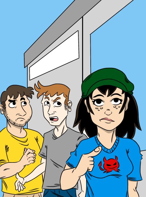
As for the blue, it's kind of a chapter one experiment. I've been mucking around with color, and have been thinking of shifting to a comic strip format. (partly due to that resizing issue) I'll likely be drawing the backgrounds in more detail and plugging them into the panels like Jeph Jacques does with Questionable Content. That would give me more consistency and the ability to maintain a regular update schedule.
Color versions of the characters would likely look a bit like this...