
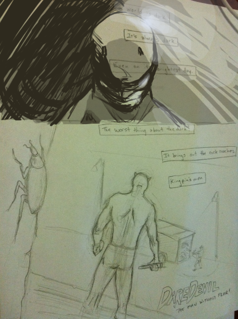
[Drawing] Daredevil concept
- Thread starter fade
- Start date
- Status
- Not open for further replies.
More options
Export threadfade
Staff member
I know. Hard to read. I don't have a scanner right now. The exposition boxes say:
1. This guy is new. What do they promise the recruits?
2. They must have a buyer lined up for museum jobs. This is the third one this week.
3. Same M.O.. Persian figurines.
4. They must be looking for something.
5. I think they found it.
6. This one.
7. Been a long time since I could see.
8. I barely remember light and dark.
9. Barely remember "bright".
10. But this figurine... it has some kind of - flaw.
I feel like two panels on this page is not enough. We need to see more as readers if this is the first page. really, you could add illustrations of anything. Just more than the two you already have.
I still feel like the bottom panel needs to be tighter. His position is too 'i'm standing in the middle of nowhere' for my taste. Are you writing this or is this an older book and you're just redoing panels???
Sorry. Also. I like the foreground going on in the bottom panel. It would also be semi-hilarious to have them crawling around on D.Devils back like Indiana Jones and the Raiders of the Lost Ark. But yeah, the scene is strong. Just needs to tighten up.
fade
Staff member
I like your edits, but at the same time, I'm used to one or two big panels on the first page. Sort of like an intake of breath before the action. That's kind of what I was going for. I'd rather fill some background across the panel behind the exposition boxes.
The whole thing is really just a speed sketch exercise. It is something I'm writing, It's funny you mention older comics, because that's what I was kind of going for. Something meant to be simple and heavily inked Frank Miller style.
The whole thing is really just a speed sketch exercise. It is something I'm writing, It's funny you mention older comics, because that's what I was kind of going for. Something meant to be simple and heavily inked Frank Miller style.
gotcha.
My last effort to persuade you not to use the profile shot in panel one. If it's only one of two panels on the page.
With a front on, you can at least play with light and dark more. (per the text)
My last effort to persuade you not to use the profile shot in panel one. If it's only one of two panels on the page.
With a front on, you can at least play with light and dark more. (per the text)
- Status
- Not open for further replies.